
Tags
I like technology, computers have revolutionized things over my lifetime and I’m grateful for them. I bought a new car through the Internet while people were still using dial-up modems. But recent developments seem to me to be going off in a bad direction. Let me explain…
In the grocery store there is mounting pressure to use the self-scan checkouts (sadly not for the customers benefit, it’s more about profit for the corporations, but I digress). I’m fully up to speed with the concept of scanning your own purchases, and apart from being far slower than the trained checkout staff, it ought to be a simple process. Not so in the Loblaws stores here in Canada. The hardware’s fine, quite good actually, but it’s the MMI, the Man-Machine Interface, that’s the issue. Whoever programmed the software is unable to read and is probably about twelve years old, at least that’s the impression I get when faced with a touch-screen that has just five pictograms on it. No words, just five coloured blocks with symbols on them.
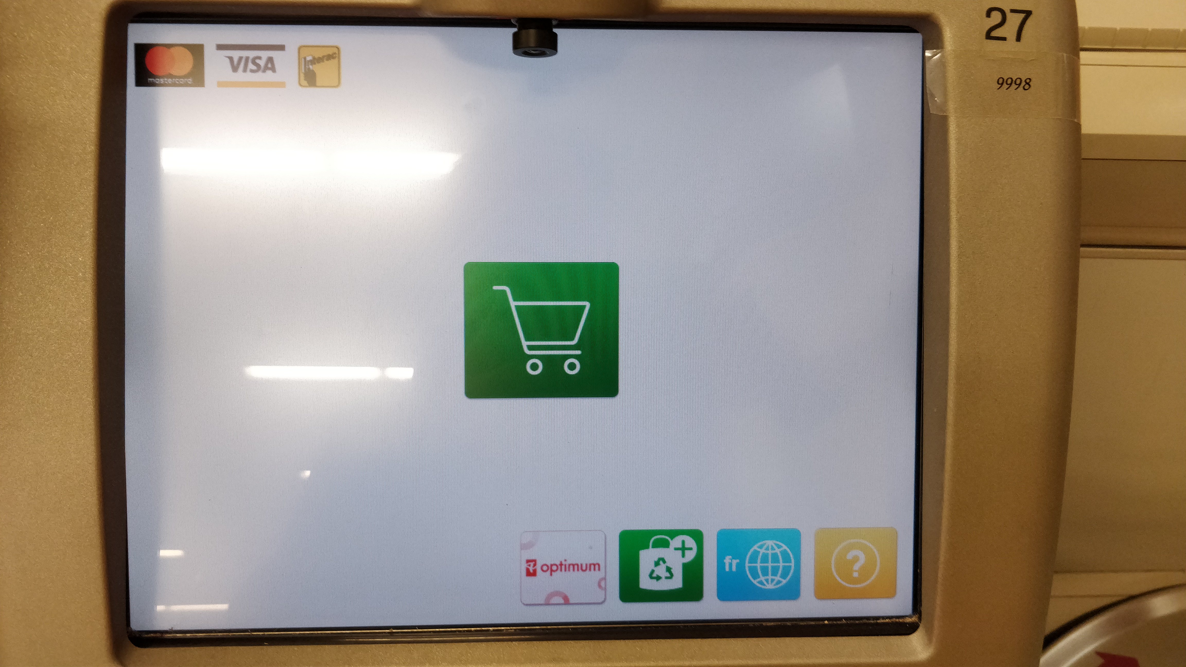
The big green one in the middle is the start scanning button, although there’s nothing to confirm that, it’s down to your interpretation as to what a picture of a shopping cart means. On the bottom of the screen, the first icon is the store’s loyalty card, Optimum. It’s anyone’s guess what will happen when you press that button because it doesn’t say. Nor does it say when or in what sequence it has to be pressed, if at all. The second icon is for you to let them know how many bags you are using, which is OK, but like the Optimum button, there’s no hint as to when and in what sequence it needs to be pressed. The third key is a bit odd because I think it allows you to access the screen in French. Don’t get me wrong, but on a screen with no words on it, I can’t help thinking that this button is surplus to requirements. The final icon is the Help button which, as I found out, hides a multitude of useful information, not least the means by which you can scan something like fruit that isn’t packaged and doesn’t have a barcode. My point here is that it’s hidden, and there’s no suggestion beyond the “?” what’s there. That screen is an abomination.
I can imagine the design brief for the MMI. Keep it clean and simple, uncluttered. Well it’s that alright, there’s no information at all. The people who developed the screen will have known exactly what the symbols mean, and in what sequence they have to be used, and they’ll have tested it many times over. But, and I’d put money on this, they didn’t let it loose with real customers first. Now I’m no dullard, and I’m quite savvy with technology, but this screen has crossed from being an uncluttered delight into a picture that means nothing. That is a big MMI failure. It’ll will have been designed by very young people who have grown up using just their Smartphones and have been using icons instead of words ever since they found out that you can get cat videos on the Internet. Here’s the thing, how many of Loblaws customers fit that age profile? Precious few I’d wager, and there’s the issue. Real people, most of them anyway, can read, at least well enough to find the words “Press this button to start scanning”. They’re also not that bothered about the screen being uncluttered – I mean, have you seen the self-service screens in McDonalds? Pictures and words, and lots of them.
Curiously, when this software was first introduced it garnered so many complaints that it was reissued with a series of written prompts and titles over the icons. I’m OK at reading, as are the vast majority of people who use the Loblaws stores, so I was quite happy to be guided through the process by the software. Now though, with the latest machines installed, they’re back to their “uncluttered” look and it’s an absolute shambles. From that screen, can you see how you’re supposed to enter a four digit fruit code? Can you tell when you’re supposed to activate the Optimum process? To claim points, or indeed to redeem them? Do you know why there’s a French language option when there’s no English words to translate? No on all counts.
It was a couple of years back when this same company went from a nice, text-based screen for their online credit card statements, to a more graphical interface. Still words, thank goodness, but in a significantly bigger font which meant that whereas you used to read almost the whole statement on one screen without scrolling, now you could only see two lines at once, the rest required much scrolling. Sure, not everyone has great eyesight, but for those with access difficulties, the computer operating systems allow you to make your text bigger if you want, it doesn’t require the MMI to feature giant writing for everyone. I couldn’t see why the change was needed, it was a backward step, so I moaned and complained about the change (and the fact that it puts ridiculous and patronizing greetings at the top of the screen, and initially failed to include an option to download data to Quicken), but I was roundly ignored.
The people who put these systems together are clearly hung up on icons and the thought that words are not required, which is odd when you think about it because everything in Loblaws stores, other than the self-checkout systems, has a ton of words written on it; from everything sold to the huge amount of signage around the store. Well, as a customer I am not going to be using the self-checkouts in Loblaws any more, and not just because they’re doing people out of jobs. If they can’t present a decent MMI for something as basic as a self-checkout system (every other store manages to do it OK), then they don’t deserve the business.
